You're ready for a new kitchen... Perhaps you just purchased your first home or it could be that you're a recent empty nester and it is finally time to focus on something other than raising children. So, what's wrong with your existing kitchen?... It could be a matter of a previous homeowner's taste not matching your own. It could be a desire for better storage, function and flow. Or your appliances are on their last legs. Perhaps your home is your largest asset and investing in its resale value makes sense.
Whatever the reason, a kitchen renovation involves a lot of planning, budgeting, decision making and disruption. The thought of it can be overwhelming for some. The best advice is to take adequate time during the design phase to fully explore your options such that when the renovation is complete there are no regrets.
In the following case study, the homeowners desire to renovate was fueled primarily by a kitchen that hadn't been touched since the 1950's... the doors were falling off the cabinets, the floor plan wasn't what people generally want in this day and age, for instance, the refrigerator was in another room. Additionally, the appliances were at the end of their lifespan and there wasn't a comfortable place for seating in the kitchen.
An examination of the problems in the existing space is a good starting point for any project...
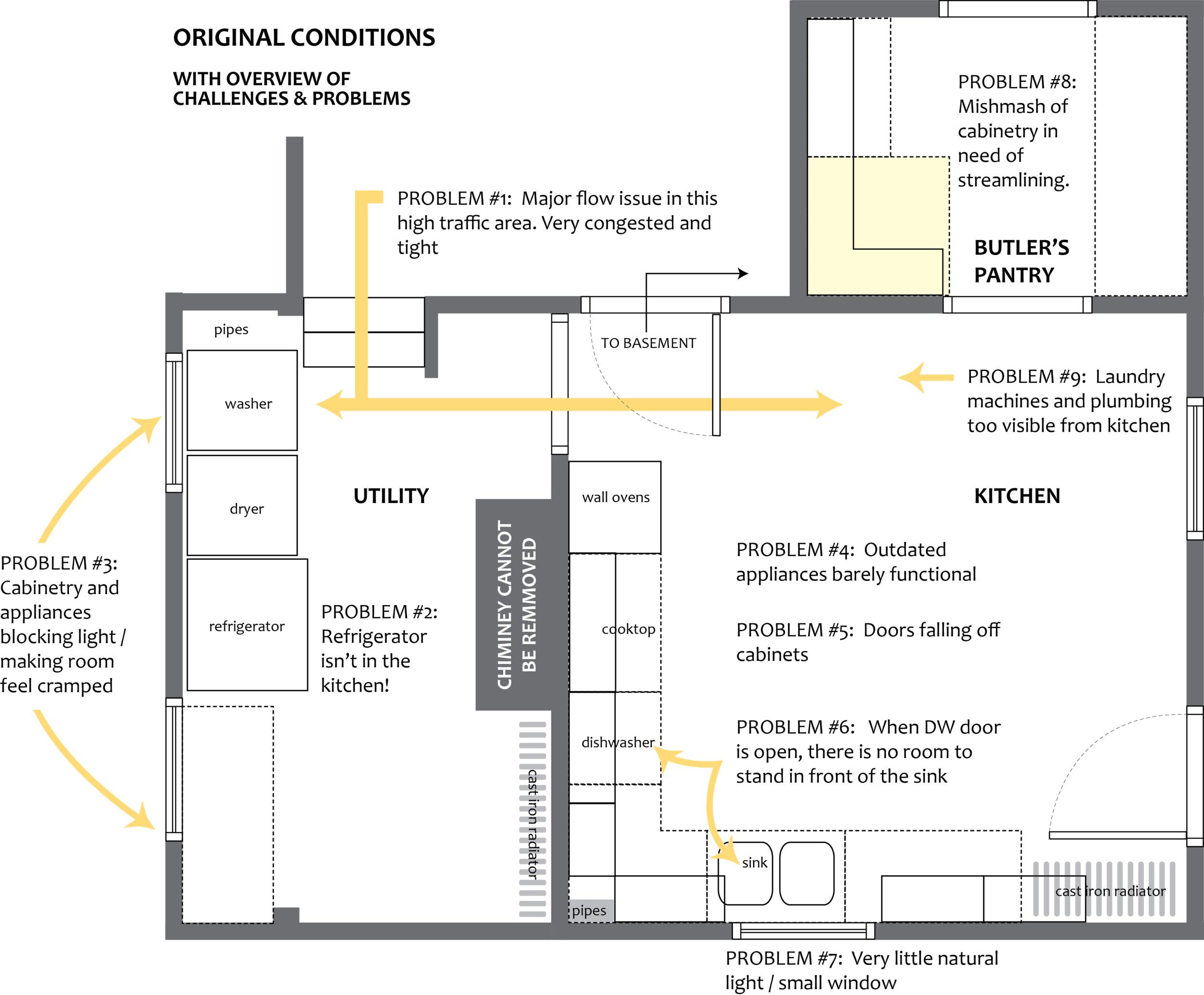
As they say, a picture is worth a thousand words...

KITCHEN BEFORE, VIEW 1
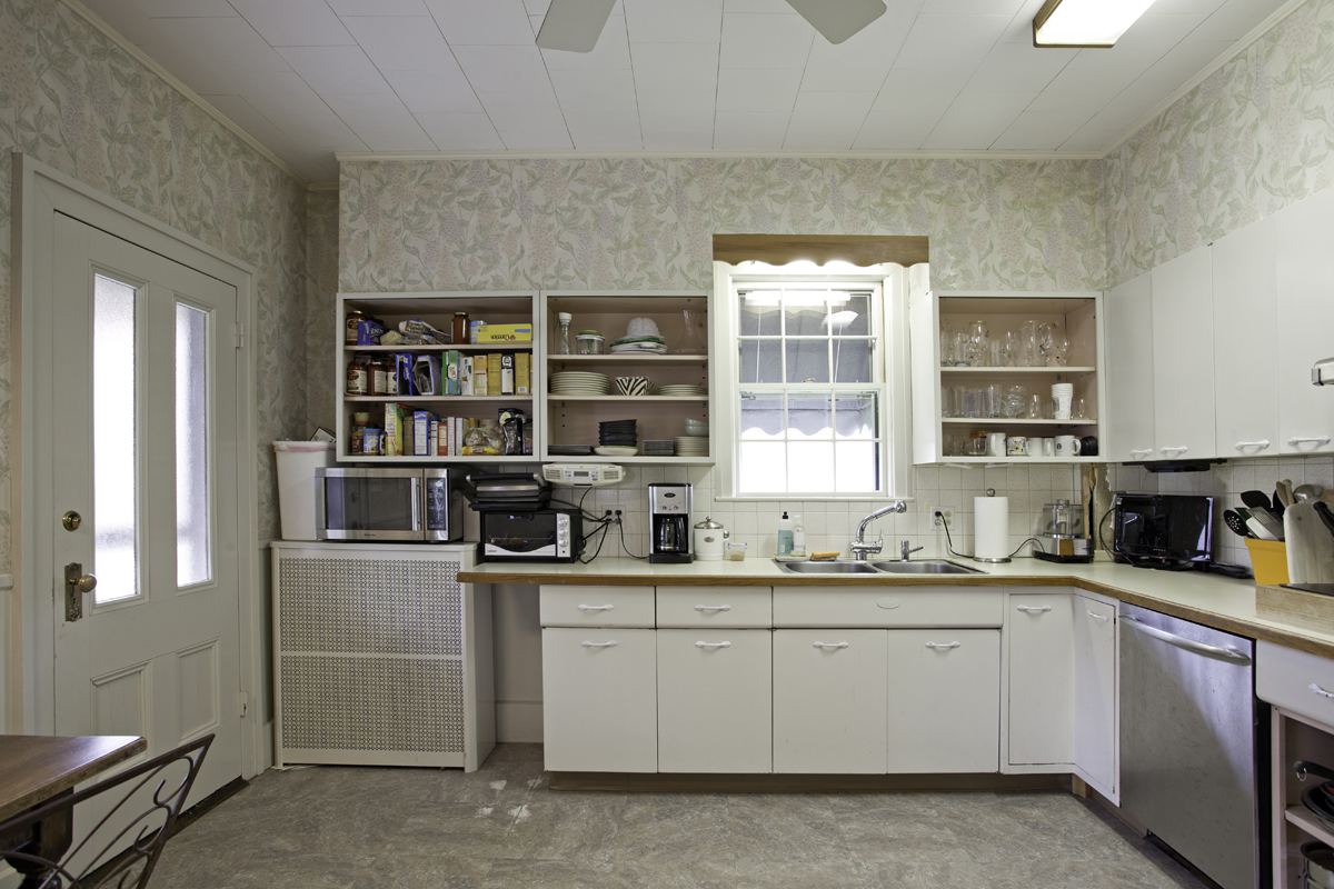
KITCHEN BEFORE, VIEW 2

UTILITY ROOM BEFORE

BUTLER'S PANTRY BEFORE
In a space of this sort, the design could have gone in a variety of directions. The first step was taking a look at the limitations and understanding which could be solved and how that solution would impact the budget and for those budget dollars, what is gained?... In this case, removal of a non-functioning chimney that ran from the basement and up three stories would have required renovations to the upper stories and was deemed cost prohibitive.
The yellow highlighted space on the plan above, in the butler's pantry is headspace for the basement stairwell and so pulling the cabinetry back to widen the pantry was not possible. Working around this limitation was necessary and as in any design project, especially an antique home, it was a "make it work" moment.
The door into the kitchen from the covered porch was in a challenging location and rendered a really good corner nearly useless - moving the entry opened up a lot of possibilities. Examining whether to keep the utility room in its current form or remove the wall between the chimney and outside kitchen wall was the next step. Some conceptual sketches ensued to determine a design direction.
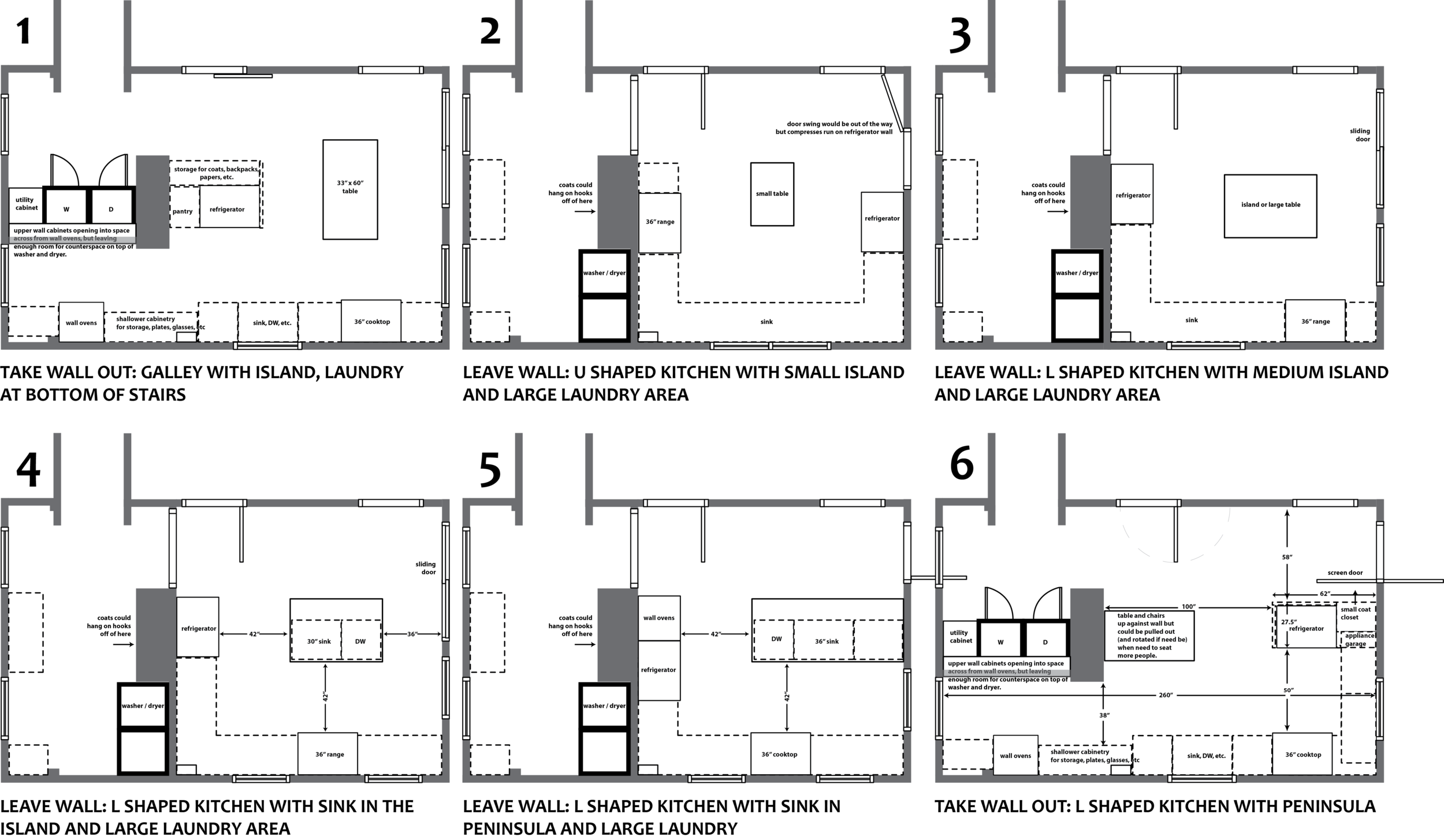
Every project should start with a list of goals - as a designer, if through creative thinking and considered space planning, I can check all the boxes, it is a feeling like no other. At times, achieving one goal, may interfere with fully realizing another. Contemplating the trade offs is a big part of renovating. In this case, whether to minimize the size of the kitchen for an expansive laundry area was under heavy consideration.
Working macro to micro on all designs, these loose early sketches to elicit debate and discussion is such an important part of the process. They really help to distill goals and determine what is most important.
Ultimately it was determined that a larger kitchen, ideally one that could seat four people at an island was of prime importance. The design process continued and the next step was a more finely tuned floor plan with a higher level of considerations. Specifically, the appliances, 48" range or 36" range... the refrigerator placement... laundry placement and whether or not the laundry area would allow for circular flow or become a dead end.

In this case, a peninsula (vs. an island) allowed for greater space utilization as well as more seating. New windows flanking a range (size to be determined) was a definite. Moving the door to the far end of the wall was also a definite. At this point, whether space could be found on an upper story for the laundry was considered and unfortunately that was not a possibility so debate continued on it's placement. Although the homeowners preferred side by side machines, opting for a stackable washer/dryer became a consideration. As mentioned previously, the design process is a matter of trade-offs, "get this, give up that" is often the case when renovating in an existing footprint.
Finessing the final floor plan, double and triple checking measurements, creating an accurate and buildable cabinet and floor plan was the next step (there aren't enough words to express the importance of accuracy!).

Applying aesthetic choices to a really workable floor plan is a matter of taste, editing and preference. The same plan would look dramatically different with walnut wood cabinets and soapstone countertops, or with cabinets painted navy blue with white quartz countertops or with cabinets painted spring green with butcher block countertops. I'm sure you get the point... And to drive it home, the aesthetic decisions at this point can take a kitchen to very different places from modern to extremely traditional.
In this case, the homeowners wanted a kitchen that was bright and fresh and which wouldn't be at odds with the 1800's home it occupied. A transitional approach developed, with the butler's pantry becoming the connection between the older parts of the house and the new kitchen. Adding windows that sit on the countertop yet blend seamlessly with the existing windows was a critical decision. The mullions on the original windows are narrow. Choosing windows by Marvin with the option of a 5/8" simulated divided lite allowed replicating this antique look in a new window. The chimney was not in good shape and thus covering it was determined the best course. A thin and smooth layer of stucco was added to allow a suitable surface for wallpaper. Etosha by Thibaut Designs was a high impact choice.
Scale is such an important element in design. This particular kitchen has very tall ceilings. A standard size range would have been dwarfed in the space. The decision to go with a 48" range by Wolf was multifold, for purposes of proper scale but also to provide an extra oven and ample cooking surfaces (bonus!: the red knobs match in nicely with the butler's pantry).
A sliding barn door allows access to the basement and ensures that those seated at the peninsula won't experience a door opening and knocking into them.
The butler's pantry became a jewel box of a room and as mentioned was the connection between the more antique parts of the house and the transitionally styled new kitchen. Choices made included: Antiqued red painted cabinets with walnut countertops, a gold leafed ceiling, battleship gray trim (to match the windows in the kitchen and to keep with the moody feel), and a sensational wallpaper that tied it all together, Silhouette by Harlequin
I've said before and will say it again... a picture is worth a thousand words...

KITCHEN AFTER, VIEW 1

THIS IS THE WINDOW THAT HAD THE WASHER & DRYER IN FRONT OF IT

BUTLER'S PANTRY AFTER
So, that is my "macro to micro" design process in a nutshell - define goals, establish limitations and whether they can be solved or need to worked around, develop design directions, refine, apply aesthetic choices - above all, ACCURACY IS NOT OPTIONAL!